Hey bloggers out there, you know when you get that email telling you about an exciting opportunity to join in on an amazing competition. All you have to do is write a blog post on something specific? Yeah, you know what I’m talking about.
I’ve been saying yes to a few too many of them recently, and after my last, I was adamant I wouldn’t say yes to another. But, the other day I got one of those emails and the subject matter spoke to me. So much, that I felt I could write something half decent out of it.
The subject?
My 1st Website
You can see how this would speak to me. I’ve previously blogged about my first website. And now I’m blogging about it again. WITH ADDED PICTURES. Shocking I know. (Though as they’re from an online archive, bits are missing from them. Wish I’d kept the site locally as an archive.)Way back in the summer of 2000, aged 15, I’d just finished my GCSE’s and had a summer of nothing to look forward to. Instead of nothing I decided to fill it with the learning of what it takes to create a website. What was my website going to be about? Why, Buffy and Angel of course. There was never a doubt in my mind.
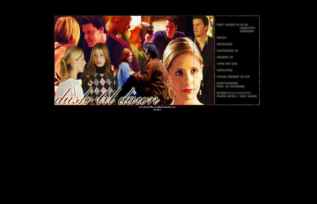
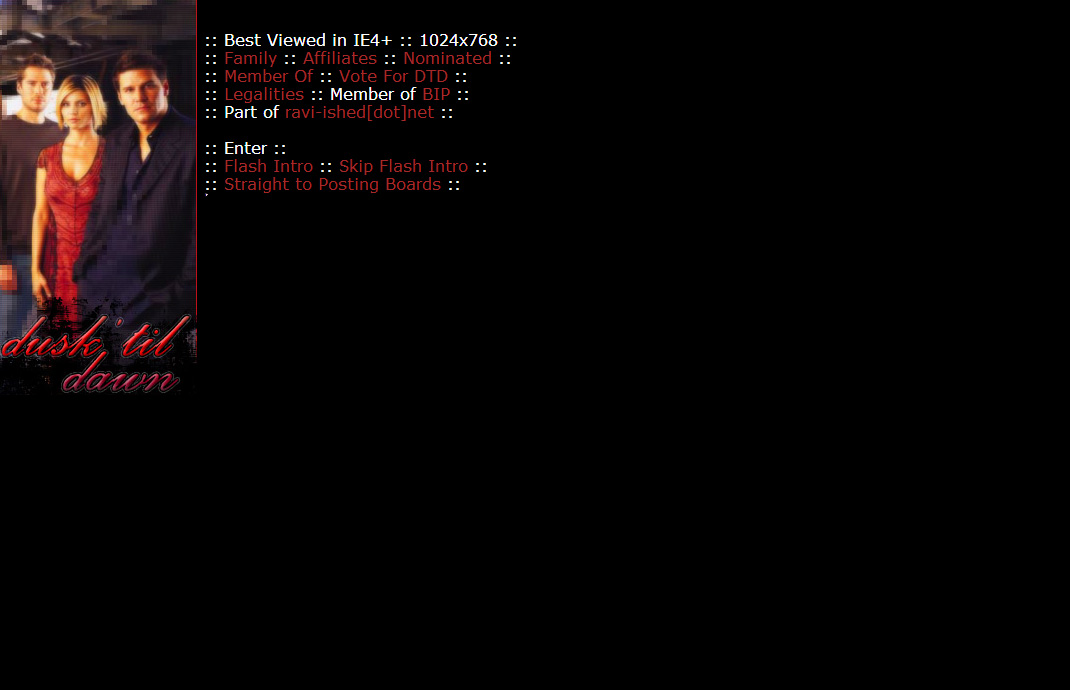
This is Dusk ’til Dawn circa 2001. Oh yes, there was a splash page. And look – I recommend IE4+. 4+!!
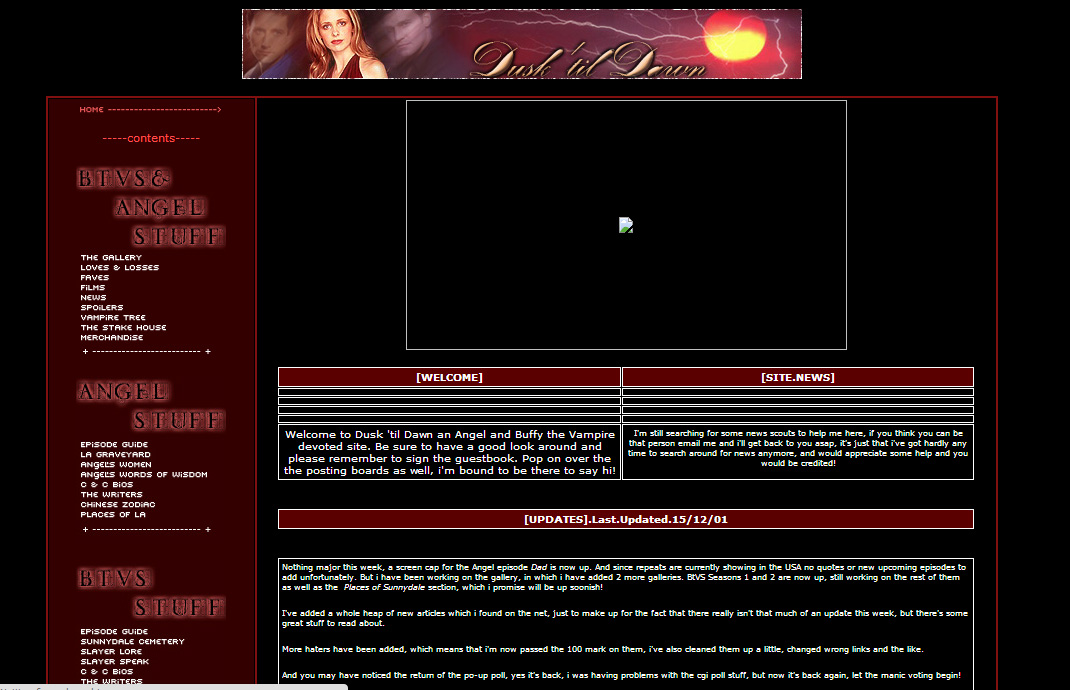
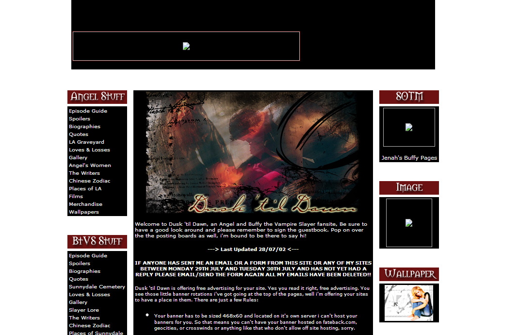
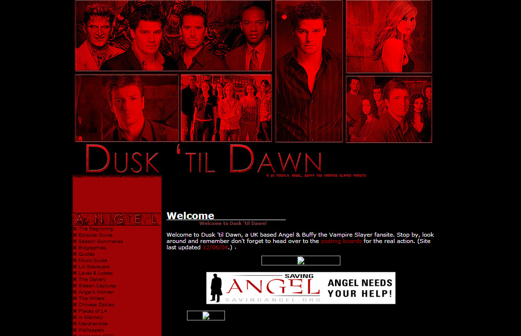
And this is what the ‘inside’ of the site looked like. Excuse the broken image there. As you might be able to guess, this is where my obsession with red and black started.
And so Dusk ’til Dawn was created. My very first website. What with it being my very first website not only did it have about 5 frames on the homepage, there was a looping flash animation (With music, proudly created in Flash), wacky hover over effects on the navigation, black background and gold coloured text. OH YES. Hey, I was young. I didn’t know what was good. Besides, I thought I had a leg up on those GeoCities sites because I had my own domain name!
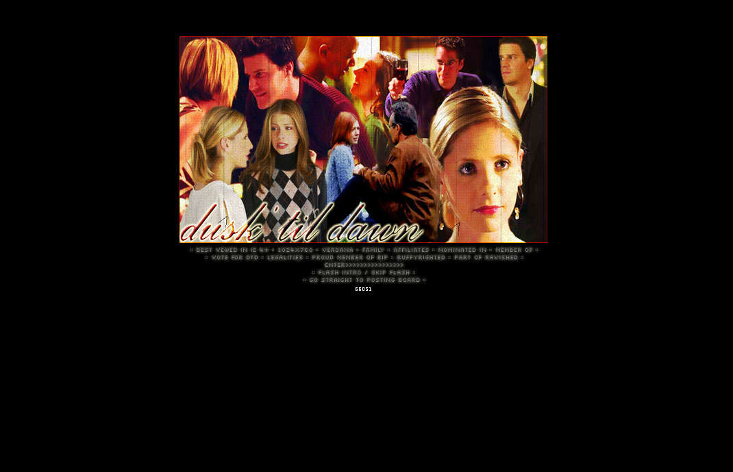
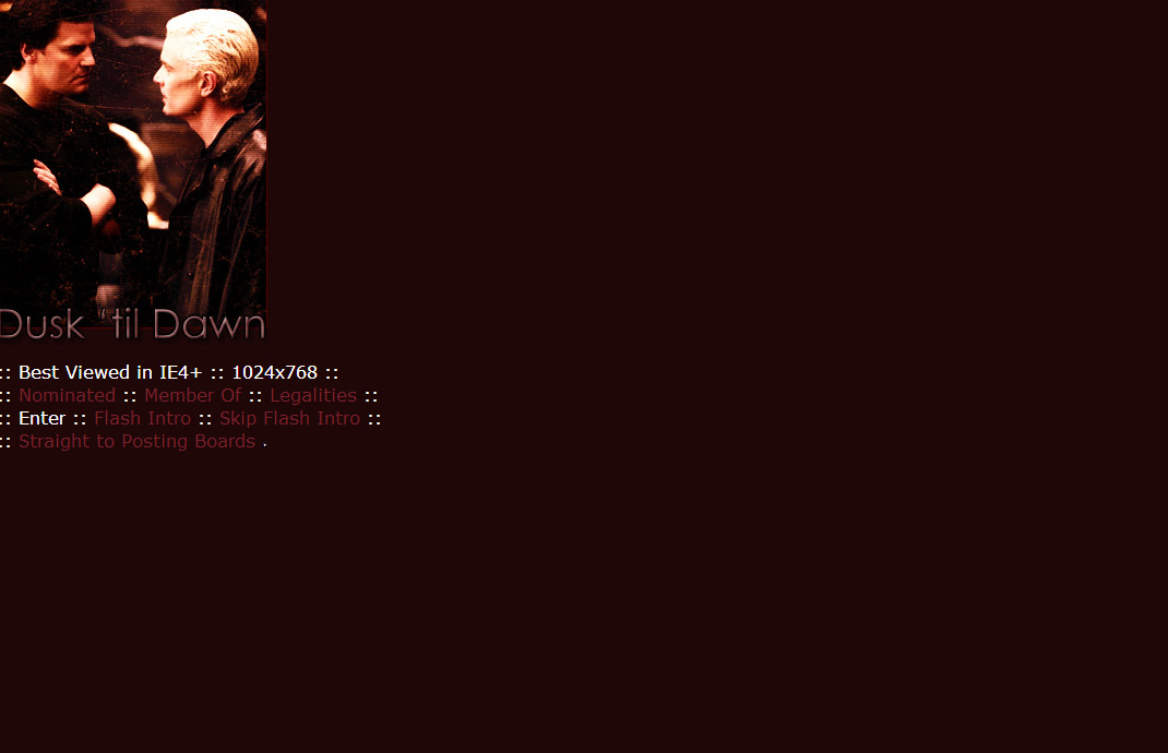
Oh look, I rejigged the splash page in 2002 for some reason.
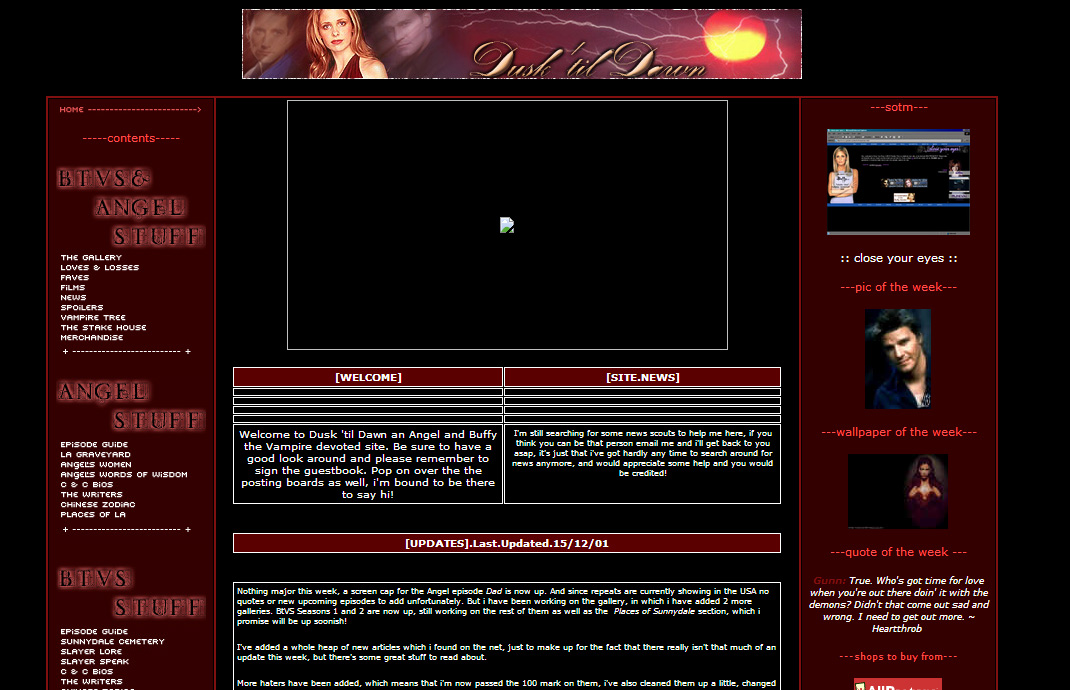
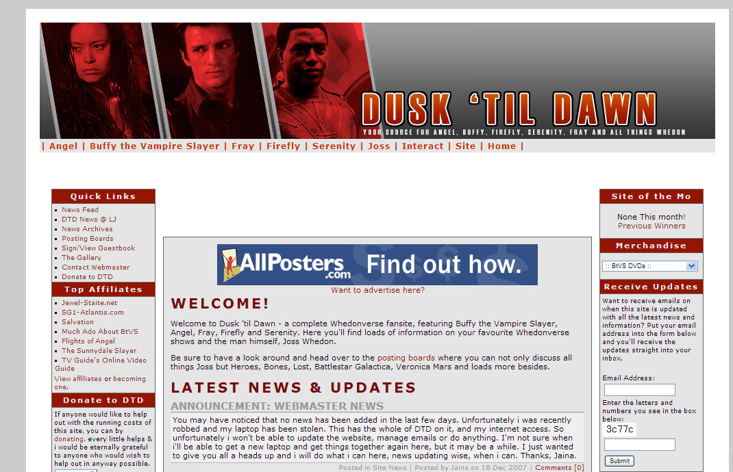
In 2002 I decided that 2 columns simply wasn’t enough for the site and a third was added. Clearly I wanted to shove as much content at who ever was browsing the site at the time.
I was hoping The Way Back Machine would have an archive of this very first layout. It did not long ago. Sadly it’s no more. The earliest screenshot is from 2001. A whole year after Dusk ’til Dawn first launched. Let me tell you, I learnt a heck of a lot in that first year.
Some time in the latter half of 2002 I decided to change the splash page. Again. Splash pages were all the rage back then if you had a fansite. Honest.
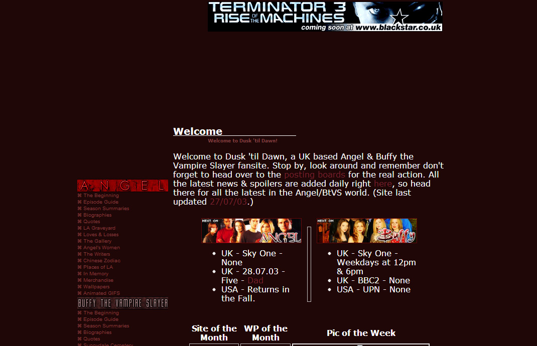
Some time in the spring/summer of 2002 I changed up the layout. Sticking to the 3 columns but added a classy background image (Digitised effect lines! YEAH!) and added advertising space. Because … money.
See, in that summer of 2000 I taught myself everything I needed to know. I had some guidance from my brother but then ran with it. Taught myself how to use Adobe Photoshop. Learnt HTML by using Microsoft FrontPage. (I kid you not.) Learnt Flash the hard way. But it stuck with me. How? I was too cool for books. So it was the Internet that taught me. And a whole bunch of trial and error. I had absolutely zero experience with graphics packages before this and my only option was to just get stuck in. The learning curve was steep, but fun.
This might just be the last ever splash page for the site.
Apologies for the lack of images, seems the archive can’t handle background images. Anywho, lots of text, some JavaScript tooltips on the navigation and as much text as I could throw at the site.
Over the years I put my new knowledge to good use. Improved the graphics, expanded the site. Started understanding HTML and design and what I should be doing as well as making things pretty. Even got to understanding the basics of JavaScript. Which came in handy. And yes. The site was built using tables. Lots and lots of tables. I didn’t know better. A lot of the people creating websites back then didn’t know much better. I did however know to use external style sheets. CSS baby! I think it wasn’t until the penultimate redesign the site got that I realised the power of divs. Power and annoyances. But mostly power.
In the mean time I dabbled with using PHP embeds for the header and footer of the site. The site’s content was growing and I couldn’t recreate every single page. PHP embeds saved my life when it came to updating the navigation and the sort.
The biggest change-up for the site since it’s birth. Gone is the black in favour of greys and whites. Nothing would make me get rid of the red though. Hell no. Oh and this one had random rotating header banners. Using PHP. Because – learning.
Some time around 2004 there was a fairly big change in the look of the site. BRIGHT reds. This layout stuck around for the longest amount of time. Think nearly 3 years. It served me well.
As the site grew in popularity I started using more scripts. Eventually I moved the entire site over to the CMS WordPress. So I had to learn a little bit of PHP to make the most out of WordPress. I promised myself that I would transfer all the content over to it too. Sadly by then I’d amassed so much content and had a shorter amount of free time, that all the content never really made it.
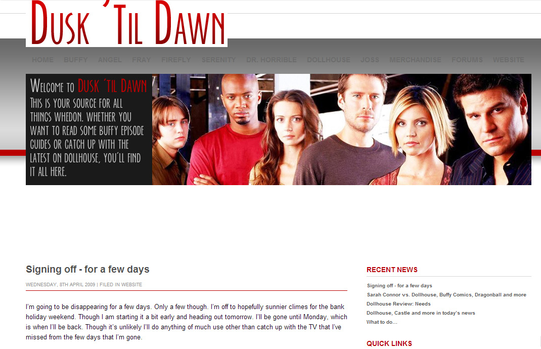
The very last layout the site ever wore. This was when the site was WordPress-ised. My first fully customised WordPress theme. I was proud. Excuse the jumbled layout at the top. Web Archive being all screwy again.
Dusk ’til Dawn shut up shop in 2010. Ten years isn’t a bad lifespan for a fansite for Buffy and Angel, and then eventually Firefly, Dollhouse, Fray and Dr. Horrible. I’m still very proud of my first website. Sometimes I wonder if I’d be working in the field I’m in right now had I not have created Dusk ’til Dawn back then.
If you’d like to check out the entire archive for how my first website looked, head over to the Way Back Machine and have a look see for yourself.
This post is my entry into 123Reg’s My 1st Website Competition.
Awww, I loved that site. The older versions of DtD bring me back ( I remember when you had the freenetname domain! ) – man, we were all so frigging close back then. I’m so glad some of us have stayed in touch!
You remember the freenetname? DUDE! To me, that was the golden age of fansites. LOVED it.
Very cool to see those pictures, I know my first site (for a band I was in) still is online even though it hasn’t been updated since about 2001 🙂 And no….I won’t send a link to it 🙂
Aww, come on, just a little peek?
Oh man, blast from the past! I remember the splash pages, we were so cool back then! And remember where you had to have a section for all the fansites you were subscribed to as well? I actually preferred your red and black layout, it fit in well with the theme of the two shows.
Yep, I remember those pages. We were all so dedicated!
Fun story. It’s like your superhero origin story, except as a blogger. 😀
Ha! Love the way you put that 😉
Though, somehow, don’t think it would make a terribly interesting film. Or comic book. Need a certain amount of spicing up!
That’s great, if you want a better laugh, check out my early days on the payback machine. Members.aol.com/bubbawheat and members.xoom.com/bubbawheat
Aww, damn, neither of those links bring up anything 🙁 I’d love to have seen your earlier work!
I remember my first web design – it was some awful design made with Trelllix software that came with my HP desktop at the time. *shudder* I learnt pretty quickly, mainly by reading source code and figuring out what bits of code did what. That said, over the 15 years I’ve been doing websites, I fell into some of the trend traps – iframes and splash pages in particular.
I really could do with taking the time to learn PHP past using it for forms and includes, and how to use WordPress for CMS. However, since I’m not actively developing sites any more, I’ve not had a reason to expand my knowledge further.
Reading source code was the key to learning for me too. It’s how I suggest people learn themselves. Not an easy way, but I always think that figuring things out for yourself, in the early days, you learn a heck of a lot.
I’d love to get back into PHP. Work doesn’t necessarily need it, really should be concentrating on JavaScript, but that stuff hurts my brain.
You sure learned a great deal from this first website!!! How cool you got to do early-on! Good luck in the competition!
Thanks Lisa!
Awww, memories!!
I’m singing that song now.
I remember Dusk ’til Dawn. It was a great site!
and I learned html from Frontpage too 🙂 div/css from different sites online and php/mysql online and with the help of a friend of a friend. Though I can still barely figure out customizing and modifying wordpress though beyond using plugins and existing themes 😉
Aww, really, you remember it? That’s awesome!
You know what, the more you do, the more you learn. So stick with it and learn as much as you can!
I have a deep abiding suspicion that all good web designers have a story like this — self taught, building a site on a lark, and looking back at it with a certain amount of chagrin at all the “design sins” they committed. Frames and tables, I knew ye well….
Fun look back at things Jaina. And hey, it could be worse — at least yours progressed. Mine kept the same basic design for years.
There’s a plateau that everyone hits at one point or another. It can be really frustrating to hit the next level after that. I’ve hit it at so many points, but don’t let it think that that’s all you can do, there’s always more. Just takes a bit more time, sadly.
Frames and tables were my best friends. But I had to break up with them. And it felt good.
Must have served you well, learning all that stuff. Useful experience to have! The good thing about web design is you can see the fruits of your labour 🙂
Yep. See the fruits and see the epic mistakes you make in the past! But then, that’s all part of the learning.
I’m afraid I didn’t understand a lot of that technical stuff. Makes me wish I knew more about it though. Looked like a great experience and achievement!
Thanks Pete! Definitely was a good experience 😀