For the past couple of days, on and off, I’ve been trying to work on Thirteen7’s website design. Since the weather went downhill I’ve been finding it harder to motivate myself. Bring back the sun!
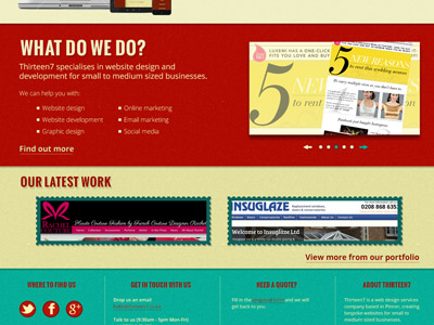
Anywho, here’s a little sneak peek at the opening page of the website. It’s only a clip of the whole page. Don’t want to give it all away. Not yet!
I was a bit nervous about the colour scheme and the direction I was going in for the look and feel. But, I’m really liking it now. I was worried about the green and red colour combination. But my fears have been abated.
There’s still a lot to do – designs for the other pages, what it’ll look like when scaled down, etc. But it feels good that it’s going forward.

So excited for you! Keep up the good work! It’s all going to be worth it soon I’m sure!
Thank you so much for the encouragement. I swear some days I just think “WTF am I doing?!”
The colours work together well I think. And I’ve seen a similar design before – where there is a quick read for each section on the opening page with links to more info – and really liked it.
I’m assuming this is the site for your website design company?
Thank you 🙂 It is for my website design company.
The design’s not a totally unique design, I think I’ve seen a lot of other freelancers and agencies use it. But it seems to work for them, so why not try it for myself!
There’s only so many unique ideas and I think even with like designs, there is always something that sets one apart from another that is similar in structure. (The one I saw before didn’t seem to have the same ‘finishing touches’ that yours have, for example, the borders on the images in the “our latest work” section.)
An old boss of mind reminded me the importance of those finishing touches. It does set things apart. Yes they’re minutiae, but still important.
He always used to really emphasise those things, I certainly learned an important lesson there!
Sharp! 😀
Can’t wait to see what you can do as you go forward. LOL 😀
Cheers Dan! I will be sprinkling more little peeks as I go forward. 😀
You are so talented Jaina! Your site looks fab!
Thank you so much Ruth!
Looks good! Nice job getting those social media buttons on there, too. It’s great to have all of the options in one spot. 😀
Oh yes… though there are so many options! Minimising to just the key 3 seemed a smart move.
Glad it’s coming together! The shades of green and red are perfect
Thank you 🙂
After I did the initial layout I suddenly got a sinking feeling that the red and green would come off a little…. seasonal! Hopefully it doesnt!
I see the green more as teal, so not seasonal to me! But trust your own eye!
It’s very bright and bubbly, just like its owner. I like it! Suits you to a T.
Aww, thanks Humaira!