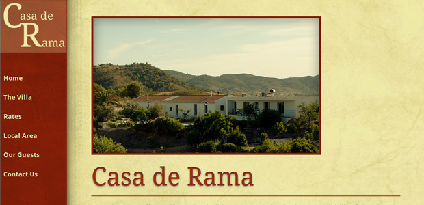
In the last week of 2011 I set about redesigning my parents’ website – Casa de Rama – advertising their rental property. The original version was really very simple. I mean really simple. It didn’t have much actual design to it. Or much thought. I threw it together really quickly so it could be used. Like a lot of websites are incorrectly made. It was also probably one of the first websites I developed using divs. I kid you not, the layout was that old.
The website had been crying out for a redesign for a long time. In fact, last year when I went back to Portugal to visit my parents for a couple of weeks over Christmas I took my laptop with me with me for the expressed reason to redesign and build them a new website. I was almost there with it. But like any holiday, I got back home and looked back at my holiday antics and was just a little disappointed.
This has happened to me before. Not the disappointing holiday antics, but the design disappointment. Happens every single time the duration of time between first designing and getting back to work on design is over a week. I’m sure other designers have experienced it too. So this time I set myself a firm target.
The Plan
In the week I had off work I wanted to design, build and push live their new website. Well, I planned to take some time off for Christmas, obviously, but the rest of the time to knuckle down and get it done. I was a little bit surprised that I managed it. Mostly because I decided to push myself and get to grips with a couple of things I don’t have any experience in.
Those being HTML5 and media queries. Creating a website that degrades nicely in different resolutions. I also wanted to throw a little bit more CSS3 into the layout. I’ve dabbled in it before, just simple stuff. I like to use CSS3 to enhance. At the moment I prefer not using it on key elements of website. As an enhancement, I’m on its side.
Make it look pretty
So the design. I had a couple of things on my list of what I wanted out of the look and feel of it. The previous version was very clinical and clean and, well, boring. Fair enough all the information was there and clear to see. But it just had no life to it. No character. So, that was my main goal of the redesign. Adding character and giving the website a feeling.
I start with sketches. Really crude, hand drawn sketches just so I have a clear idea of what I want the layout to look like before I even open up Photoshop.
I was trying so hard to stay away from the colour red (It seems to be my fallback colour.), but it just felt right here. There are red tiles in the villa, the roof tiles are red. Even part of the outside patio has a bit of red in it. My initial choice was blue and cream. While I liked the look of it initially, on going back to the design, it just felt a little cold. Red gave it some warmth. Gave it a bit more of a feeling of a sunny, Mediterranean climated country.
Next up was a bit of texture. I love textured background on websites. Subtle ones. Just to give pages a bit more depth and not such a flat feeling. I don’t stick textures everywhere, but here it felt necessary. Grabbed the paper texture from one of the many from Stock Exchange.
Now for the fonts. I’m not all that great at font choosing or typography. I want to be better at it. In my head I wanted a simple serif font for the main titles and <h1> elements and then just one other different, but complimentary, san-serif font for the body. However, I knew I didn’t want to use the bog standard Times New Roman and Arial combination. For one thing, I don’t think they really compliment each other!
I wanted all text to be live text. Despite my initial plans on using image replacement. Why bother when there’s so many options of using actual fonts on your website, these days? I googled and found some font combination examples and settled into using Google’s web fonts and went for the bog standard combination of Droid serif for the main titles and Droid sans for the body text. One day I’ll get more adventurous. I’m just not all that educated in the use of downloaded fonts and the legallity of embedding them using @font-face. I know you can’t just embed any font you’ve downloaded. On my next project I’ll venture into that I think.
HTML5 Wuuhh?!
Being a bit of a newbie to HTML5 I headed over to HTML5 Boilerplate to use their boilerplate. I’ve read a fair bit about it and how easy it is to use. Watched Divya Manian’s video and got going. Really recommend the video walk-through. It’s short, concise and exactly what you need to get started.
I’ll admit, I didn’t add much more HTML5 mark-up than was already there in the boilerplate. I didn’t feel I needed to. Though I did get confused. Mostly down to the interpretation of some of the HTML5 tags. For example, <article> and <section>. Do <section>‘s go in <articles>‘s or vice versa. Googling the subject didn’t give me a clear answer. Other web developers out there are using their own interpretations of it as it’s not all that clear.
So what did I decide? I decided to not faff with the homepage but on the guest testimonial page I put each testimonial in an <article>. That felt appropriate, but if you think otherwise, let me know. I’m still learning.
I think most, if not all, the CSS3 I dabbled in was adding shadows to text and form elements. I love being able to enhance elements using CSS3 rather than faffing around in Photoshop and creating images for backgrounds and shadows and what nots. Sure, you need some of that as a fall-back. But as I’ve said before, I’ve added these little bits as enhancements. The site looks fine without them, so no fall-backs for those who can’t see CSS3. Sorry! I know it’s not the right way to do it, but … sorry!
You know what I also didn’t do the right way? The columns. Bloody HTML and it’s inability to have a <div> that stretches 100% height of the viewport. There are hacks and work-arounds. But they were proving too fiddly. I completely forgot how tricky it is to get a <div> that stretches to the height of the viewing area. What did I do? A List Apart’s Faux Column technique. I didn’t want to use a tiled background image and position elements, but it was my only option. On my development plan for the site I do intend on rooting out a bit of JavaScript that’ll grab the height of the viewing area and insert that into a <div>, but this will do for now.
Scripting it up
Thanks to the HTML5 Boilerplate I didn’t have to worry too much about jQuery and scripts – everything’s in it! So all I had to do was find an appropriate form script for the Contact Us page and a jQuery carousel for the The Villa page.
For any jQuery carousel, I usually go for malsup’s jQuery cycle plugin. Easy to use and incredibly lightweight with loads of options. However, I tried it here and whilst sometimes it worked, most of the time it didn’t. Didn’t take me long to figure out why. malsup’s jQuery cycle plugin embeds image sizes for the items in the carousel in the HTML. So for a responsive website, it just wouldn’t cut it.
So hello FlexSlider. The title on the website calls it The best responsive jQuery Slider, and I think I’ll be agreeing with them on that and this will now be my go-to jQuery slider plugin. Effortless is the word I’d use for it.
With that out of the way, finding a form script (that’s free) was a bit trickier. I was tempted to write my own, as I’ve done in the past, in PHP. But it’s been years and I was under a few of my own time constraints.
Thanks to CSS Tricks I found what I was looking for – a nice and simple contact form. It’s got no bells and whistles on it, but it does what I need it to do currently. I’ve got plans to add more to it, spam protection for one! Just a simple test to see whether the form user is human.
Talking about CSS Tricks, I couldn’t have made the site without it. A completely invaluable resource and I feel the need to thank Chris Coyier for sharing so much useful… stuff! Everything from CSS3 media-queries examples to general tips. Couldn’t have done without having such an excellent, free resource.
Going with the flow
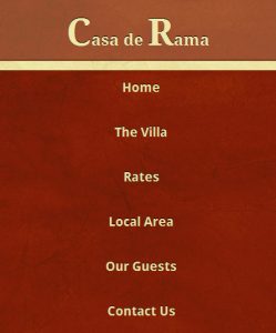
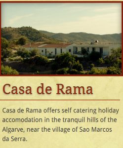
The responsive part of the site is a small bit of a cheat. The left hand navigation has a fixed position and size. It’s the main content area that’s fluid. So that’s my little cheat, so that I didn’t have to think too much about various different resolutions. I concentrated on that and a layout for smartphones in portrait. Simple solution – title, vertical navigation and then the content. I’ve got some slightly different CSS for the content area for smartphones in portrait – padding and widths mostly.
The only thing that confused me were the actual CSS3 media queries. It’s something that I haven’t found a resolution for either. Are you meant to use max-device-width or max-width? I’m currently using without the device part of the syntax. Is that incorrect?
… in Conclusion
The whole website redesign, from sketches to Photoshop to coding to live took about 3 days. About a day spent on the design, half a day tweaking the design and then the rest of the time was spent building it. A lot less time than I was expecting. However, there’s plenty more for me to do to keep adjusting and fixing issues, but overall I’m happy with how my first foray into HTML5 and responsive design has turned out. In fact I’m thinking, from now on, to make sure all the websites I create are responsive.
I initially set out to do this project from a mobile-first point of view. But that didn’t really work out. The ‘mobile version’ still has to download and use a few of the same assets as the fully web version. Which isn’t great. But, like I’ve been saying, I’m still learning.
Sidenote: I really should have done some screen grabs of the before. I think the biggest part of me just wanted to see the back of the design and not to ever be reminded of it. Next time I do a redesign, I’ll remember to document the previous design. Lesson learnt.


I’ll be honest, I didn’t understand all of this.
But website pretty.
I enjoyed reading this post. It was cool to see how you incorporated responsive design into your workflow. I think responsive design is great, so long as you and your client understand the additional time requirements. Sometimes it’s hard enough just to get clients to agree to rates for regular, static width projects. Having to educate them and getting a thumbs up for a responsive solution is going to be an interesting challenge going forward. Designing for multiple devices at once seems like a no-brainer, but we must be compensated for our efforts, yes? I like the fact that there are lots of frameworks being created that help cut down the time for responsive designs.
Responsive design inspiration (a must have in the RSS feed):
http://mediaqueri.es/
A good resource for testing responsive sites (click “device sizes” on the right):
http://mattkersley.com/responsive/
Oh, and thank you for mentioning Flex Slider! Very useful. Bookmarked!
Flexslider was a little lifesaver for me!
Thanks for those 2 links Jason, really useful stuff! I tested the site out using the second link and was really happy to see that it looks fine in all of them! Phew! Bookmarking for future use.
Educating the clients is always the key thing. Thankfully here, as it was my parents, I didn’t have to struggle with that. But I think it might be getting easier these tells to get them to understand, if they want the most out of their website and to have the best reach they need to have the mobile and tablet market in mind. More so these days when a lot of people aren’t having desktops or laptops, but just tablets and phones. Of course, you can’t push anyone to have something they don’t really want to have.
Having all the frameworks out there is a big help. I know for a fact that I wouldn’t have been able to do what I did in the amount of time without using HTML5 Boilerplate. I forgot to mention one framework I found during my build process – the 320 and up framework – http://www.stuffandnonsense.co.uk/projects/320andup/ – focuses on mobile first design and uses the updated HTML5 boilerplate. Think I’ll try that next time.
Oh and of course there’s http://www.initializr.com/ too. Another great little framework.
I have to say, that has been a job well done, Jaina. The fact that it was also done in 3 days is pretty damn impressive!
Anytime the phrase ‘100% height’ arises, I tense up. You’d have thought that would’ve been made much simpler by now (unless it has been and i’m the dark and still using fixes). I’m a newbie to HTML5 but you’ve inspired me to delve further into it, and since I have a project coming up that would definitely benefit from the responsive approach, I may as well start learning.
Highly informative post, thank you 🙂
I definitely think that there’s a need for responsive layouts and thanks to CSS3 and media queries, it’s just been made easier for us. Just having a fluid layout makes a responsive website.
Give it a try with your new project. It’ll be a bit of a learning curve in the beginning, but well worth it.
Congrats on the redesign Jaina. Isn’t it really cool to learn on the fly how to do these things and then doing it? 😀
Exactly it. And now that I’m slowly teaching myself these things, it should be a bit easier next time around! In theory anyway!
Cool to read although I have not looked at coding for ages.
You can always use the Internet Archive: Wayback Machine for looking at older versions of sites:
http://web.archive.org/web/20081120202108/http://countryvilla-algarve.com/
Completely forgot about the way back machine! Mostly because it’s blocked at work for me. Bizarre. Ahh, now I can look back and grimace.
[…] Most Helpful Piece – Getting my tech on […]